TAKI 183
His widely circulated New York tags helped bring public attention to the city’s writing culture in the early 1970s.
Graffiti / 1970s
Names and letters became a language of style, visibility and contested public space.
Modern name-based graffiti writing has important roots in Philadelphia as well as New York. CORNBREAD is a key figure in Philadelphia’s history. In New York, TAKI 183’s repeated signature and a 1971 newspaper profile brought wider attention to tagging. Many other writers developed the practice alongside them; its history is a network, not a single origin story.
A name could assert presence in a city where young people felt overlooked. Repetition created recognition, while the form of the letters became a way to distinguish one writer from another. Graffiti writing developed before the four-element idea became established, later sharing people, spaces and cultural associations with hip hop.
New York’s subway system made a writer’s work mobile. A painted train could cross neighborhoods and encounter audiences far beyond the place where it was made. Writers competed for visibility and style; photographs and personal networks preserved work that might soon be cleaned away.
Train yards also carried serious dangers, including moving trains, electrified tracks and legal consequences. Romanticizing the finished image should not conceal those risks or the burdens placed on transit workers and riders. Studying subway art is different from encouraging trespass. Legal walls offer another space to develop the craft.
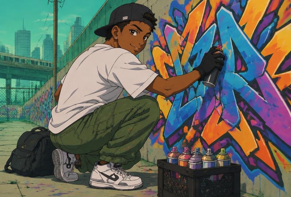
A tag is a stylized signature. A throw-up is generally a quickly executed form with simplified letters, often an outline and fill. A piece—short for masterpiece—is a more elaborate composition. Wildstyle describes complex, interlocking lettering that can be difficult for an unfamiliar viewer to read. “Burner” is a term of praise for especially strong work, not a universal technical category.
Letter structure, spacing, color relationships and the handling of outlines all contribute to style. Characters and background elements can support the letters, but complexity alone does not guarantee impact. Writers learn through practice, observation and exchanges that may take place in sketchbooks long before a wall is painted.
PHASE 2 helped shape influential letter forms and style vocabulary. DONDI became renowned for carefully structured, ambitious compositions. FUTURA explored abstraction alongside writing, while LADY PINK developed a distinctive visual practice and challenged the male-dominated assumptions of the scene.
These names are entry points into a larger history. Crews, photographers and less widely celebrated local writers also shaped what survived and what became visible. Giving credit means naming the artist and recognizing the context, rather than treating graffiti as anonymous decoration.
Graffiti raises enduring questions about who controls public space, whose messages are welcome and who bears the cost of an intervention. Community murals and commissioned walls can support expression, but permission alone does not settle every question: residents’ priorities and an artist’s creative independence still matter.
Writing now circulates through galleries, design, fashion and international festivals. Local scenes adapt techniques to their own languages and environments. The practice can become a livelihood without losing all connection to its origins, but celebrating its influence should include respect for property, public safety and the people whose styles made that influence possible.
Give the pioneers their flowers
His widely circulated New York tags helped bring public attention to the city’s writing culture in the early 1970s.
A pioneering woman in New York subway writing who carried her artistic voice into murals and painting.
Renowned for carefully constructed letterforms and influential subway pieces, including the “Children of the Grave” series.
A writer’s stylized name or signature, built through distinctive lettering.
A quickly executed name, often in rounded letters with a simple fill and outline.
An intricate lettering approach with interlocking forms, arrows and extensions that can challenge readability.
Short for masterpiece: a more developed lettering work, usually with multiple colors and a planned composition.
Follow the movement
Share a lettering influence or a piece you have permission to show.
@planet4elementsThe Planet 4 Elements dispatch
Hip hop stories, pioneer spotlights and fresh perspectives on the four elements.
Planet 4 Elements · Each one, teach one.